
Just attempted a first scan - I've zipped it, maybe somebody would like to see if they can open it ? Anybody that has the time to have a look through it I would be eternally grateful. Car just doesn't seem to get going at higher revs - seems to struggle/gets held back.
| Home | WikiLEC | Repairs | Upgrades | Gallery | Buy & Sell | Mountain Chips | Meets & Events | Contact |
|
First Scan - anybody fancy a gander ?!
Moderators: theelanman, dapinky, Specky, clemo, Nige, Sy V, Dave Eds, DaveT, Elanlover, muley, Enright, algirdas, nitroman, GeoffSmith
46 posts
• Page 1 of 3 • 1, 2, 3
First Scan - anybody fancy a gander ?!
 by simonbuk » Sat 02.11.2024, 18:16
You do not have the required permissions to view the files attached to this post.
Black S2 No.357
Aqua Blue S2 No.385
Simonthesailor
"Twenty years from now you will be more disappointed by the things that you didn't do than by the ones you did. So buy an Elan" - Mark Twain.
Aqua Blue S2 No.385
Simonthesailor
"Twenty years from now you will be more disappointed by the things that you didn't do than by the ones you did. So buy an Elan" - Mark Twain.
-
simonbuk - God
- Posts: 1600
- Joined: Sun 13.03.2016, 12:50
- Location: Mostly Worthing,West Sussex, sometimes the canals.......
Re: First Scan - anybody fancy a gander ?!
by simonbuk » Sat 02.11.2024, 18:18
Oh - that doesn't seem to have worked 

Black S2 No.357
Aqua Blue S2 No.385
Simonthesailor
"Twenty years from now you will be more disappointed by the things that you didn't do than by the ones you did. So buy an Elan" - Mark Twain.
Aqua Blue S2 No.385
Simonthesailor
"Twenty years from now you will be more disappointed by the things that you didn't do than by the ones you did. So buy an Elan" - Mark Twain.
-
simonbuk - God
- Posts: 1600
- Joined: Sun 13.03.2016, 12:50
- Location: Mostly Worthing,West Sussex, sometimes the canals.......
Re: First Scan - anybody fancy a gander ?!
by simonbuk » Sat 02.11.2024, 19:36
Jesus..........what format do you save the file in ??
Black S2 No.357
Aqua Blue S2 No.385
Simonthesailor
"Twenty years from now you will be more disappointed by the things that you didn't do than by the ones you did. So buy an Elan" - Mark Twain.
Aqua Blue S2 No.385
Simonthesailor
"Twenty years from now you will be more disappointed by the things that you didn't do than by the ones you did. So buy an Elan" - Mark Twain.
-
simonbuk - God
- Posts: 1600
- Joined: Sun 13.03.2016, 12:50
- Location: Mostly Worthing,West Sussex, sometimes the canals.......
Re: First Scan - anybody fancy a gander ?!
by simonbuk » Sat 02.11.2024, 22:32
I've got this slightly reduced excel file -
You do not have the required permissions to view the files attached to this post.
Black S2 No.357
Aqua Blue S2 No.385
Simonthesailor
"Twenty years from now you will be more disappointed by the things that you didn't do than by the ones you did. So buy an Elan" - Mark Twain.
Aqua Blue S2 No.385
Simonthesailor
"Twenty years from now you will be more disappointed by the things that you didn't do than by the ones you did. So buy an Elan" - Mark Twain.
-
simonbuk - God
- Posts: 1600
- Joined: Sun 13.03.2016, 12:50
- Location: Mostly Worthing,West Sussex, sometimes the canals.......
Re: First Scan - anybody fancy a gander ?!
by TorqueHorse » Sat 02.11.2024, 22:44
When you are in ElanScan and you have the captured data, I typically do File>Save As> and then give it a name, but keep the .ecu file type extension. Then in your File Explorer, you can just change the suffix from .ecu to .zip instead of actually zipping it. Just let folks know when you post it that they need to manually change the file type back.
That's what I did to the one I've attached here.
That's what I did to the one I've attached here.
You do not have the required permissions to view the files attached to this post.
-Matt N
'91 FED M100 -rolling resto
...and come to Salt Lake City, for the very first truly national Lotus Car Club event for the USA: LUG September 24-28, 2026
'91 FED M100 -rolling resto
...and come to Salt Lake City, for the very first truly national Lotus Car Club event for the USA: LUG September 24-28, 2026
-

TorqueHorse - Fanatic
- Posts: 723
- Joined: Wed 01.01.2020, 07:42
- Location: Austin, TX
Re: First Scan - anybody fancy a gander ?!
by simonbuk » Sun 03.11.2024, 14:52
Ok thanks, seem to have lost my ECU file ??!!
From a quick look I noticed that I have had maximum boost but rarely had over 100 bhp ? Only once I think - seems odd ?
From a quick look I noticed that I have had maximum boost but rarely had over 100 bhp ? Only once I think - seems odd ?
Black S2 No.357
Aqua Blue S2 No.385
Simonthesailor
"Twenty years from now you will be more disappointed by the things that you didn't do than by the ones you did. So buy an Elan" - Mark Twain.
Aqua Blue S2 No.385
Simonthesailor
"Twenty years from now you will be more disappointed by the things that you didn't do than by the ones you did. So buy an Elan" - Mark Twain.
-
simonbuk - God
- Posts: 1600
- Joined: Sun 13.03.2016, 12:50
- Location: Mostly Worthing,West Sussex, sometimes the canals.......
Re: First Scan - anybody fancy a gander ?!
by chrism » Sun 03.11.2024, 15:41
Yep, unless you tell it specifically where to go it usually ends up in 'downloads' or perhaps, even, 'documents'...
Here's what I do. I called this file (say) log5 when asked to 'save as'
This white log5.ecu file is like the one you need to ZIP up (right click on it->compress->ZIP):-

and you attach the yellow 'zipped' file in the same way as you'd do with a pic...
Your zipped file came through as this and I'm not sure what it can tell us, especially about bhp and boost...
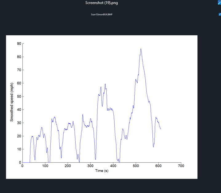
Sooo.......zip and attach your whole EScan log file so's we can see all the elements of your data - then perhaps a LEC 'star' will be able to illuminate your running problem (hur...)
Here's what I do. I called this file (say) log5 when asked to 'save as'
This white log5.ecu file is like the one you need to ZIP up (right click on it->compress->ZIP):-
and you attach the yellow 'zipped' file in the same way as you'd do with a pic...
Your zipped file came through as this and I'm not sure what it can tell us, especially about bhp and boost...
Sooo.......zip and attach your whole EScan log file so's we can see all the elements of your data - then perhaps a LEC 'star' will be able to illuminate your running problem
(hur...)-
chrism - God
- Posts: 894
- Joined: Sun 16.01.2022, 14:36
- Location: West Sussex, UK
Re: First Scan - anybody fancy a gander ?!
by simonbuk » Sun 03.11.2024, 20:37
Yes ignore that graph - it doesn't relate to what I was saying !
Looks like I'll have to do it all over again unless people like looking at Excel spreadsheets !
Looks like I'll have to do it all over again unless people like looking at Excel spreadsheets !
Black S2 No.357
Aqua Blue S2 No.385
Simonthesailor
"Twenty years from now you will be more disappointed by the things that you didn't do than by the ones you did. So buy an Elan" - Mark Twain.
Aqua Blue S2 No.385
Simonthesailor
"Twenty years from now you will be more disappointed by the things that you didn't do than by the ones you did. So buy an Elan" - Mark Twain.
-
simonbuk - God
- Posts: 1600
- Joined: Sun 13.03.2016, 12:50
- Location: Mostly Worthing,West Sussex, sometimes the canals.......
Re: First Scan - anybody fancy a gander ?!
by chrism » Sun 03.11.2024, 22:41
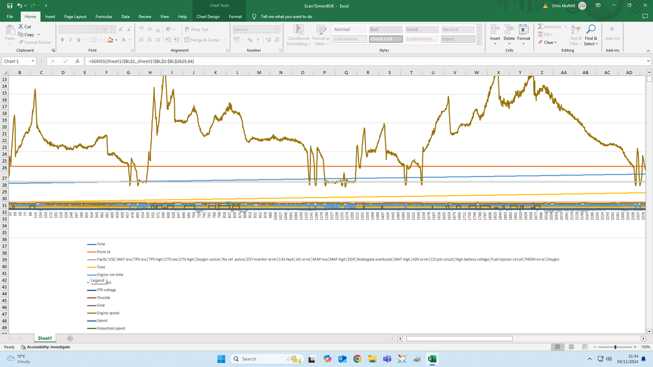
 Erm...Escan might be a little more digestible
-
chrism - God
- Posts: 894
- Joined: Sun 16.01.2022, 14:36
- Location: West Sussex, UK
Re: First Scan - anybody fancy a gander ?!
by simonbuk » Mon 04.11.2024, 23:45
Oooh - what's that ?! How did you get it to that ?!
Black S2 No.357
Aqua Blue S2 No.385
Simonthesailor
"Twenty years from now you will be more disappointed by the things that you didn't do than by the ones you did. So buy an Elan" - Mark Twain.
Aqua Blue S2 No.385
Simonthesailor
"Twenty years from now you will be more disappointed by the things that you didn't do than by the ones you did. So buy an Elan" - Mark Twain.
-
simonbuk - God
- Posts: 1600
- Joined: Sun 13.03.2016, 12:50
- Location: Mostly Worthing,West Sussex, sometimes the canals.......
Re: First Scan - anybody fancy a gander ?!
by chrism » Tue 05.11.2024, 01:22
I don't use excel much at all so I don't know much about it but I unzipped your 2nd scan - the excel one - and pushed a graph-drawing button  .
.
I think it's drawn some sort of graph of everything but the axes and scales don't make a lot of sense, if any, and I couldn't see an obvious way of seperating the elements. I'd imagine there's a way of drawing graph lines seperately for chosen columns but I can't imagine excel to be as 'clevva' as EScan by sorting out axes and scales in order to make the data mean anything more sensible.
Just a couple of thoughts:-
1. Why not do a (say) 5min tickover EScan data grab that might outline anything basic before giving it beans to check bhp or boost etc. That way the 'horse' could be inspected for injury before it bolts out of the stable and gallops off down the road?
2. Your excel data shows you're on promid 1499, your air:fuel ratio is constantly spot-on at 14.7:1 your boost peaked at just about 0.6 at 86mph (line 2008) - so a standard ecu map? Horsepower readings made no sense on line 2008. I couldn't see an O2 sensor voltage, so I wonder if you're using Ron's excellent EScan_beta update and new protocol?
3. ps it looks like your highest revs were ~4200 at your highest speed...again line 2008 on the excel spreadsheet
.I think it's drawn some sort of graph of everything but the axes and scales don't make a lot of sense, if any, and I couldn't see an obvious way of seperating the elements. I'd imagine there's a way of drawing graph lines seperately for chosen columns but I can't imagine excel to be as 'clevva' as EScan by sorting out axes and scales in order to make the data mean anything more sensible.
Just a couple of thoughts:-
1. Why not do a (say) 5min tickover EScan data grab that might outline anything basic before giving it beans to check bhp or boost etc. That way the 'horse' could be inspected for injury before it bolts out of the stable and gallops off down the road?
2. Your excel data shows you're on promid 1499, your air:fuel ratio is constantly spot-on at 14.7:1 your boost peaked at just about 0.6 at 86mph (line 2008) - so a standard ecu map? Horsepower readings made no sense on line 2008. I couldn't see an O2 sensor voltage, so I wonder if you're using Ron's excellent EScan_beta update and new protocol?
3. ps it looks like your highest revs were ~4200 at your highest speed...again line 2008 on the excel spreadsheet
Last edited by chrism on Wed 06.11.2024, 01:36, edited 1 time in total.
-
chrism - God
- Posts: 894
- Joined: Sun 16.01.2022, 14:36
- Location: West Sussex, UK
Re: First Scan - anybody fancy a gander ?!
by simonbuk » Tue 05.11.2024, 14:44
Thanks for having a look - saw the air/fuel ration was good too.
It is standard as far as I know but a new car to me so anything could have happened.
Good idea about just doing another run just on start up
I'll start again, delete all files and downloads and go back to the beginning !
It is standard as far as I know but a new car to me so anything could have happened.
Good idea about just doing another run just on start up
I'll start again, delete all files and downloads and go back to the beginning !
Black S2 No.357
Aqua Blue S2 No.385
Simonthesailor
"Twenty years from now you will be more disappointed by the things that you didn't do than by the ones you did. So buy an Elan" - Mark Twain.
Aqua Blue S2 No.385
Simonthesailor
"Twenty years from now you will be more disappointed by the things that you didn't do than by the ones you did. So buy an Elan" - Mark Twain.
-
simonbuk - God
- Posts: 1600
- Joined: Sun 13.03.2016, 12:50
- Location: Mostly Worthing,West Sussex, sometimes the canals.......
Re: First Scan - anybody fancy a gander ?!
by simonbuk » Thu 07.11.2024, 12:10
Right - here we go again - deleted everything, started again.
Please see attached -
I'll go out for a run once I know this has worked !!
This was simply starting it up and letting it idle for 5 minutes.
Any help appreciated.
Please see attached -
I'll go out for a run once I know this has worked !!
This was simply starting it up and letting it idle for 5 minutes.
Any help appreciated.
You do not have the required permissions to view the files attached to this post.
Black S2 No.357
Aqua Blue S2 No.385
Simonthesailor
"Twenty years from now you will be more disappointed by the things that you didn't do than by the ones you did. So buy an Elan" - Mark Twain.
Aqua Blue S2 No.385
Simonthesailor
"Twenty years from now you will be more disappointed by the things that you didn't do than by the ones you did. So buy an Elan" - Mark Twain.
-
simonbuk - God
- Posts: 1600
- Joined: Sun 13.03.2016, 12:50
- Location: Mostly Worthing,West Sussex, sometimes the canals.......
Re: First Scan - anybody fancy a gander ?!
by chrism » Thu 07.11.2024, 12:53
Yep, that's much better
I've attached a recent .zip scan of mine. I'm no EScan expert but if you overlay my data on your graphs I think you'll get more of a 'feel for the normality' of your m100.
Lots of bits co-incide but in particular if you compare O2 sensor volts with mine (yours are blue mine's are black) they're VERY different - yet your air:fuel ratio is fine - so I'm a bit confused.
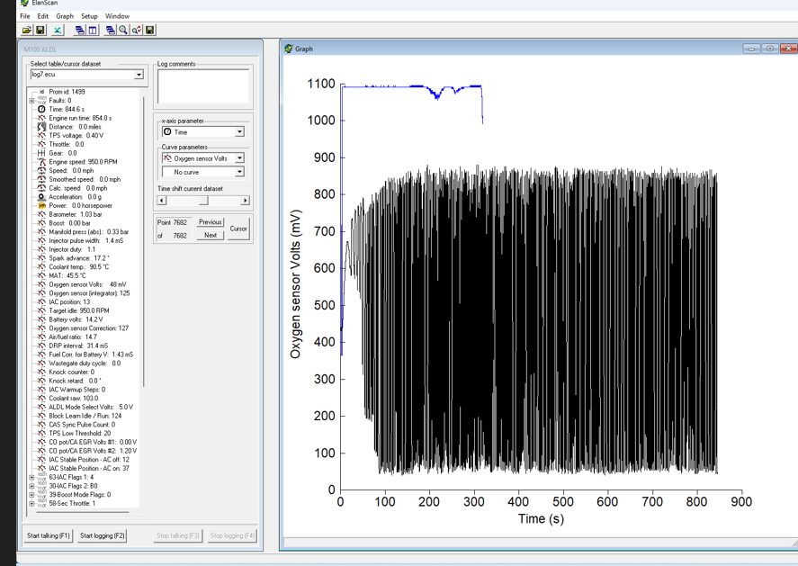
My first thoughts are a 'duff' O2 sensor, or perhaps a different version of Escan + its protocol, so let's hope an EScan guru might be able to provide more insight.
I've attached a recent .zip scan of mine. I'm no EScan expert but if you overlay my data on your graphs I think you'll get more of a 'feel for the normality' of your m100.
Lots of bits co-incide but in particular if you compare O2 sensor volts with mine (yours are blue mine's are black) they're VERY different - yet your air:fuel ratio is fine - so I'm a bit confused.
My first thoughts are a 'duff' O2 sensor, or perhaps a different version of Escan + its protocol, so let's hope an EScan guru might be able to provide more insight.
You do not have the required permissions to view the files attached to this post.
-
chrism - God
- Posts: 894
- Joined: Sun 16.01.2022, 14:36
- Location: West Sussex, UK
Re: First Scan - anybody fancy a gander ?!
by simonbuk » Thu 07.11.2024, 13:23
Interesting - I followed the links and instructions from the 'Manuals' page as thought that would be best, maybe thats not the latest ?
I could remove the O2 sensor from my other car to prove a point i guess ?
I could remove the O2 sensor from my other car to prove a point i guess ?
Black S2 No.357
Aqua Blue S2 No.385
Simonthesailor
"Twenty years from now you will be more disappointed by the things that you didn't do than by the ones you did. So buy an Elan" - Mark Twain.
Aqua Blue S2 No.385
Simonthesailor
"Twenty years from now you will be more disappointed by the things that you didn't do than by the ones you did. So buy an Elan" - Mark Twain.
-
simonbuk - God
- Posts: 1600
- Joined: Sun 13.03.2016, 12:50
- Location: Mostly Worthing,West Sussex, sometimes the canals.......
Re: First Scan - anybody fancy a gander ?!
by simonbuk » Thu 07.11.2024, 14:32
@ChrisM - think you might be onto something !
Checked the O2 sensor and had no reading when checked with an ammeter, checked the one in my other car and had a reading of .35 (or maybe 3.5 ?! can't remember ).
But the one in my new car seems dead. I'll swap them over when i've found a tool big enough ...........
As you say though, odd that the air/fuel ratio seems corrct .
.
Is there a second sensor after the cat that might be helping
Checked the O2 sensor and had no reading when checked with an ammeter, checked the one in my other car and had a reading of .35 (or maybe 3.5 ?! can't remember
).But the one in my new car seems dead. I'll swap them over when i've found a tool big enough ...........
As you say though, odd that the air/fuel ratio seems corrct
.Is there a second sensor after the cat that might be helping
Black S2 No.357
Aqua Blue S2 No.385
Simonthesailor
"Twenty years from now you will be more disappointed by the things that you didn't do than by the ones you did. So buy an Elan" - Mark Twain.
Aqua Blue S2 No.385
Simonthesailor
"Twenty years from now you will be more disappointed by the things that you didn't do than by the ones you did. So buy an Elan" - Mark Twain.
-
simonbuk - God
- Posts: 1600
- Joined: Sun 13.03.2016, 12:50
- Location: Mostly Worthing,West Sussex, sometimes the canals.......
Re: First Scan - anybody fancy a gander ?!
by Tuga2112 » Thu 07.11.2024, 15:08
simonbuk wrote:Checked the O2 sensor and had no reading when checked with an ammeter,
are you sure you used an ammeter ?
i dont think a current check would be helpful
Still learning
Youtube Channel @Tuga2112 M100 repair videos
Youtube Channel @Tuga2112 M100 repair videos
-

Tuga2112 - God
- Posts: 3039
- Joined: Fri 12.09.2014, 22:54
- Location: Durham with a regular trip to Walsall
Re: First Scan - anybody fancy a gander ?!
by simonbuk » Thu 07.11.2024, 15:19
Tuga2112 wrote:simonbuk wrote:Checked the O2 sensor and had no reading when checked with an ammeter,
are you sure you used an ammeter ?
i dont think a current check would be helpful
Multimeter......
Black S2 No.357
Aqua Blue S2 No.385
Simonthesailor
"Twenty years from now you will be more disappointed by the things that you didn't do than by the ones you did. So buy an Elan" - Mark Twain.
Aqua Blue S2 No.385
Simonthesailor
"Twenty years from now you will be more disappointed by the things that you didn't do than by the ones you did. So buy an Elan" - Mark Twain.
-
simonbuk - God
- Posts: 1600
- Joined: Sun 13.03.2016, 12:50
- Location: Mostly Worthing,West Sussex, sometimes the canals.......
Re: First Scan - anybody fancy a gander ?!
by chrism » Thu 07.11.2024, 15:29
simonbuk, if you get stuck then pop in. I've got a sensor removal tool - and a spare sensor, actually...long story
With the greatest of respect I've found that the older/original legacy EScan stuff is a bit 'dated' esp for later win10 and all win11 users.
There's a LEC post mostly by RonR/Matts1972/KenS that's effectively rescued it from obscurity, upgraded it for current windows versions, ironed out some errors and made it relevant and accurate again This is where you'll find the new ElanScan_beta and its new protocol software.
In fact, I think the new Elanscan_beta + protocol is now a 'sticky' in the Elanscan section so's us LEC-ers can have access to the up-to-date 'goodies' w/out spending ages trawling for the original thread.
With the greatest of respect I've found that the older/original legacy EScan stuff is a bit 'dated' esp for later win10 and all win11 users.
There's a LEC post mostly by RonR/Matts1972/KenS that's effectively rescued it from obscurity, upgraded it for current windows versions, ironed out some errors and made it relevant and accurate again
This is where you'll find the new ElanScan_beta and its new protocol software. In fact, I think the new Elanscan_beta + protocol is now a 'sticky' in the Elanscan section
so's us LEC-ers can have access to the up-to-date 'goodies' w/out spending ages trawling for the original thread.Last edited by chrism on Fri 08.11.2024, 00:48, edited 1 time in total.
-
chrism - God
- Posts: 894
- Joined: Sun 16.01.2022, 14:36
- Location: West Sussex, UK
Re: First Scan - anybody fancy a gander ?!
by simonbuk » Thu 07.11.2024, 20:11
Found the new file so I'll replace it shortly.
I wonder if a diesel injector tool is the same size - as I have one of those - somewhere.
I might yet come up to you
I wonder if a diesel injector tool is the same size - as I have one of those - somewhere.
I might yet come up to you
Black S2 No.357
Aqua Blue S2 No.385
Simonthesailor
"Twenty years from now you will be more disappointed by the things that you didn't do than by the ones you did. So buy an Elan" - Mark Twain.
Aqua Blue S2 No.385
Simonthesailor
"Twenty years from now you will be more disappointed by the things that you didn't do than by the ones you did. So buy an Elan" - Mark Twain.
-
simonbuk - God
- Posts: 1600
- Joined: Sun 13.03.2016, 12:50
- Location: Mostly Worthing,West Sussex, sometimes the canals.......
46 posts
• Page 1 of 3 • 1, 2, 3
Who is online
Users browsing this forum: No registered users and 3 guests